A Study In Romantic Garden Design
The Editorial
Last spring, Stoneblossom collaborated with an extraordinary team of vendors to create an editorial for Style Me Pretty in charming Newport, Rhode Island. We blended together whimsical garden style arrangements with classic coastal charm creating a story that felt rooted not only in romance, but in the history of the island city itself. Putting a modern twist on traditional style, we paired bold patterns with heirloom accents creating an eclectic, layered design plan that highlighted romantic spring blooms.
The goal was to evoke the feeling of a dinner party in one of Newport’s generational homes - highlighting the epitome of everything the city has to offer. The shoot was hosted at the Gardiner House, a boutique hotel off of historic Thames St, whose vibrant decor and unique charm perfectly complimented the feel for the day.
The Vision
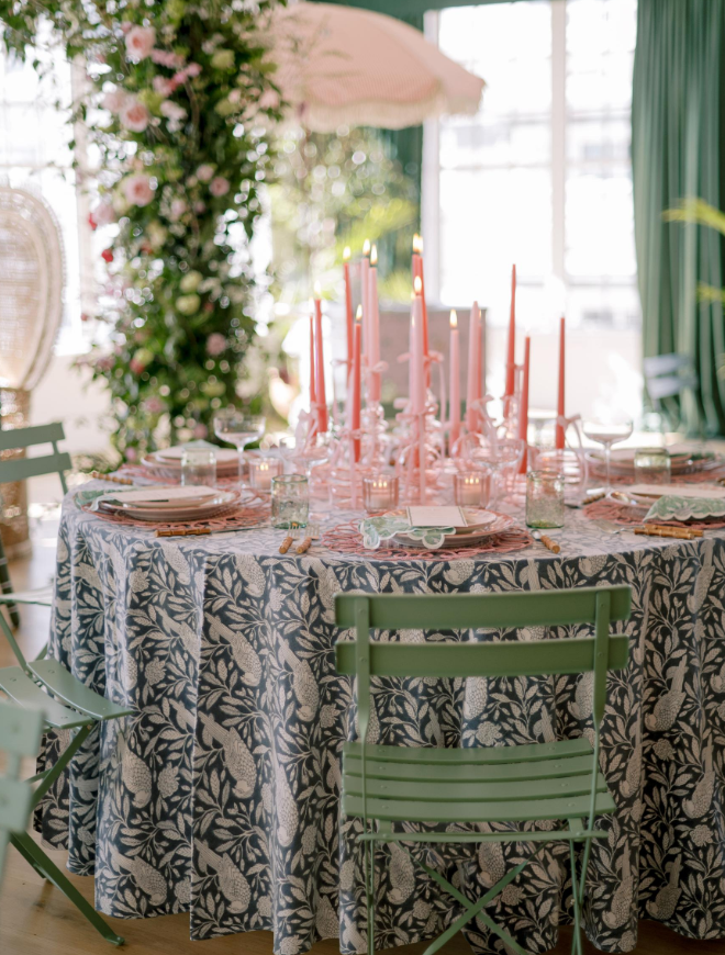
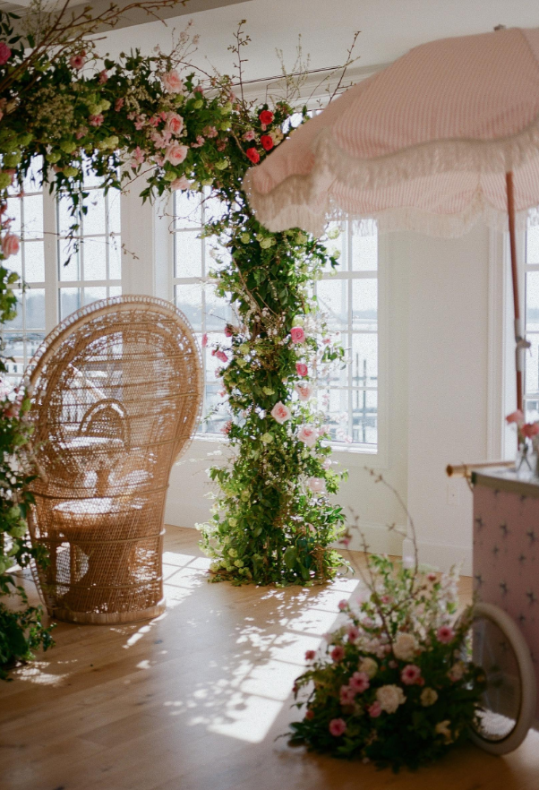
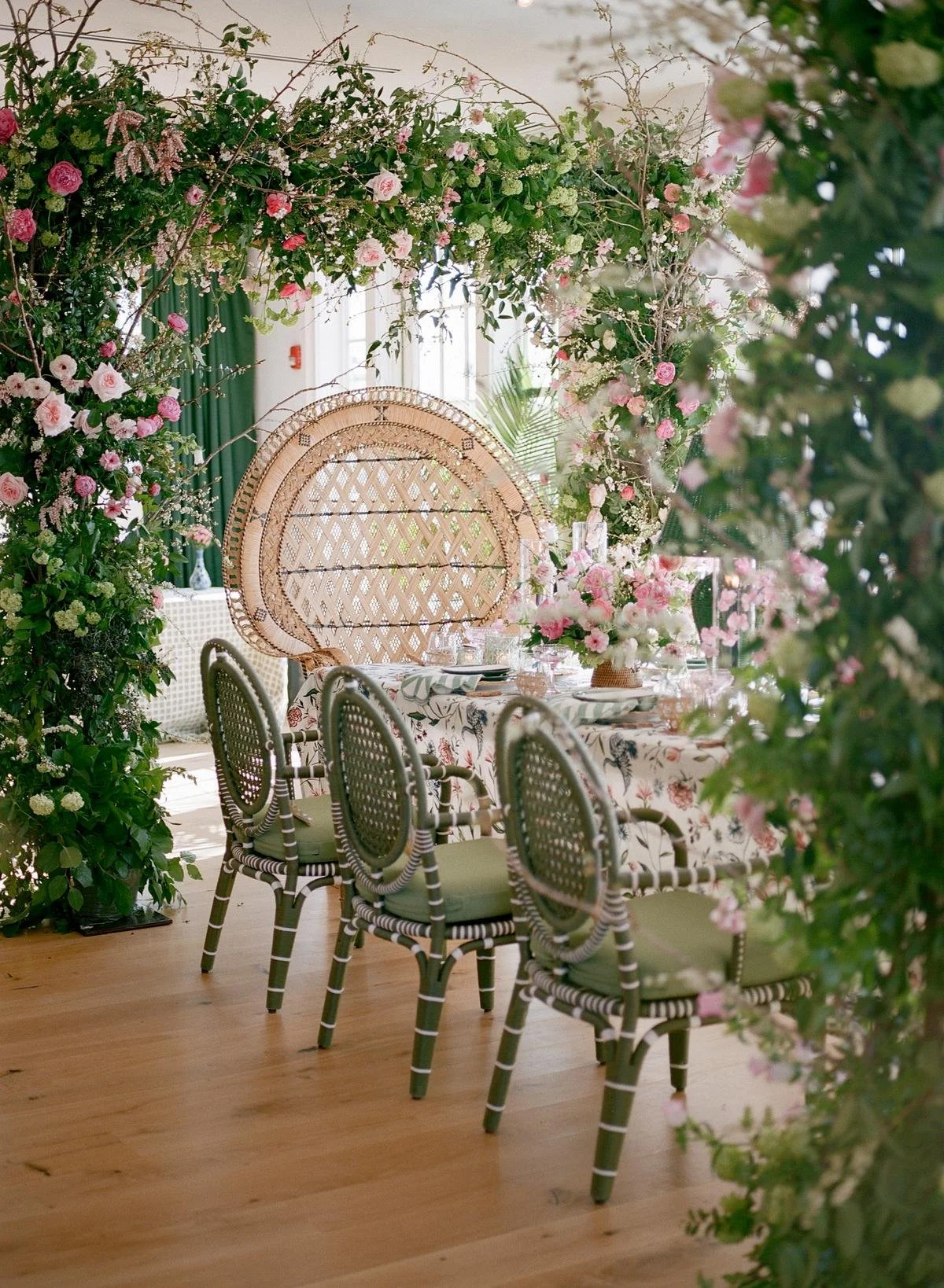
The shoot was conceptualized by Kate Murtagh who not only wanted to show the best of Newport, but wanted to play within the Grandmillenial aesthetic. The design was layered yet nuanced, blending the perfect ratio of vintage and modern accents, creating a curated, whimsical feel. Not only are patterns layered, but so are textures and colors, creating an exciting story told across the tablescape.
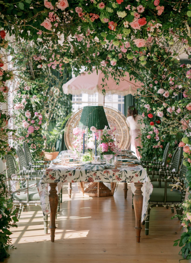
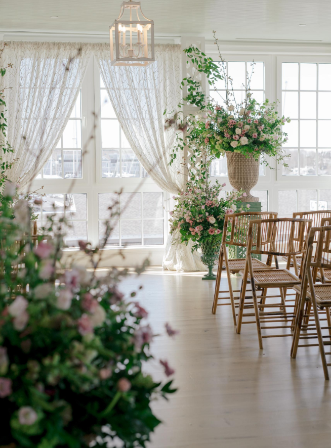
It was important to have multiple focal moments that made up a greater whole. From the double arches at the head table, to the place settings, each interaction was thoughtfully curated and designed with the vision in mind, resulting in an impeccably styled and wonderfully immersive experience at every turn.
We wanted to create an environment that felt personalized and lived-in, to achieve this we utilized mismatched china, oversized chairs, and table top lamps we begin to feel a venue transform into something else. The air in the room was jubilant, inviting you to celebrate in the romance of the day.
The Details
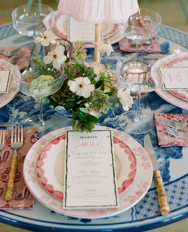
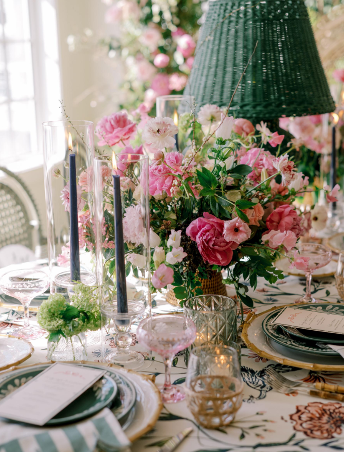
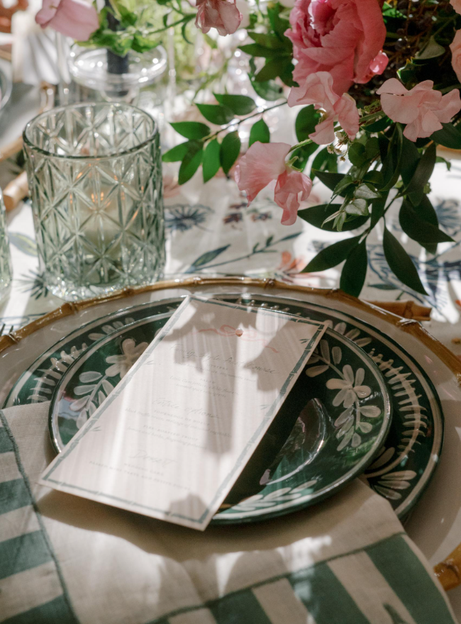
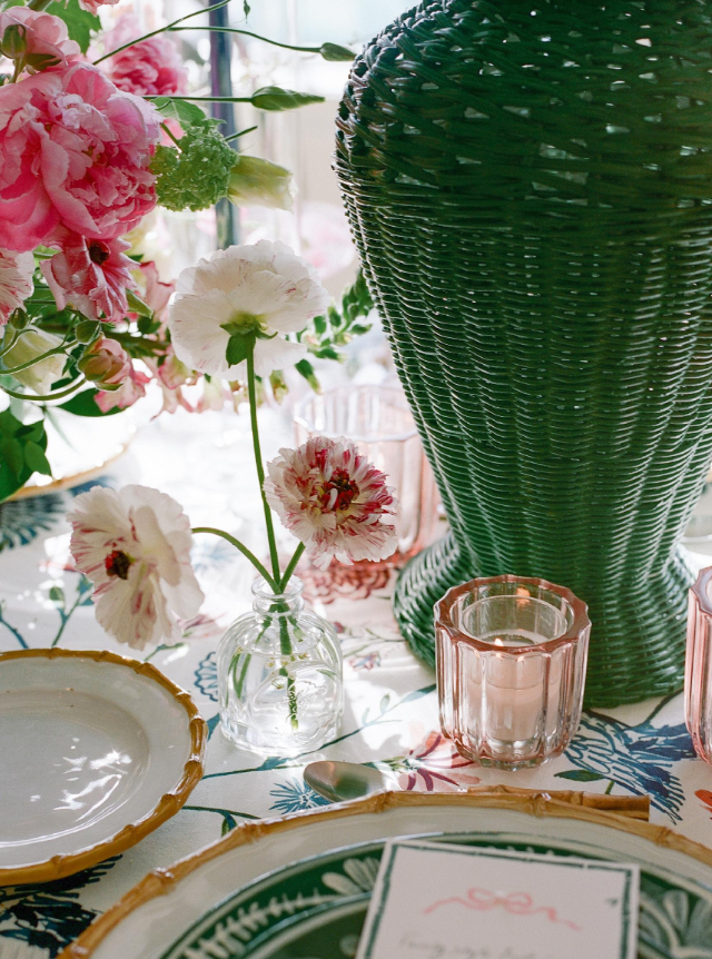
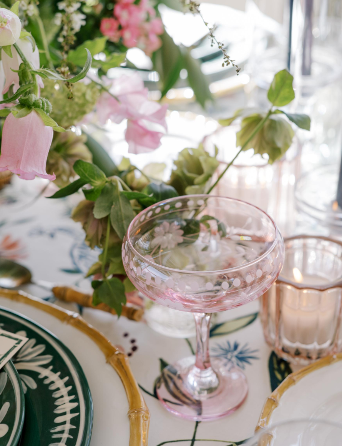
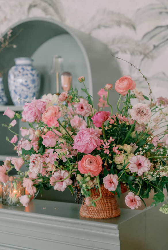
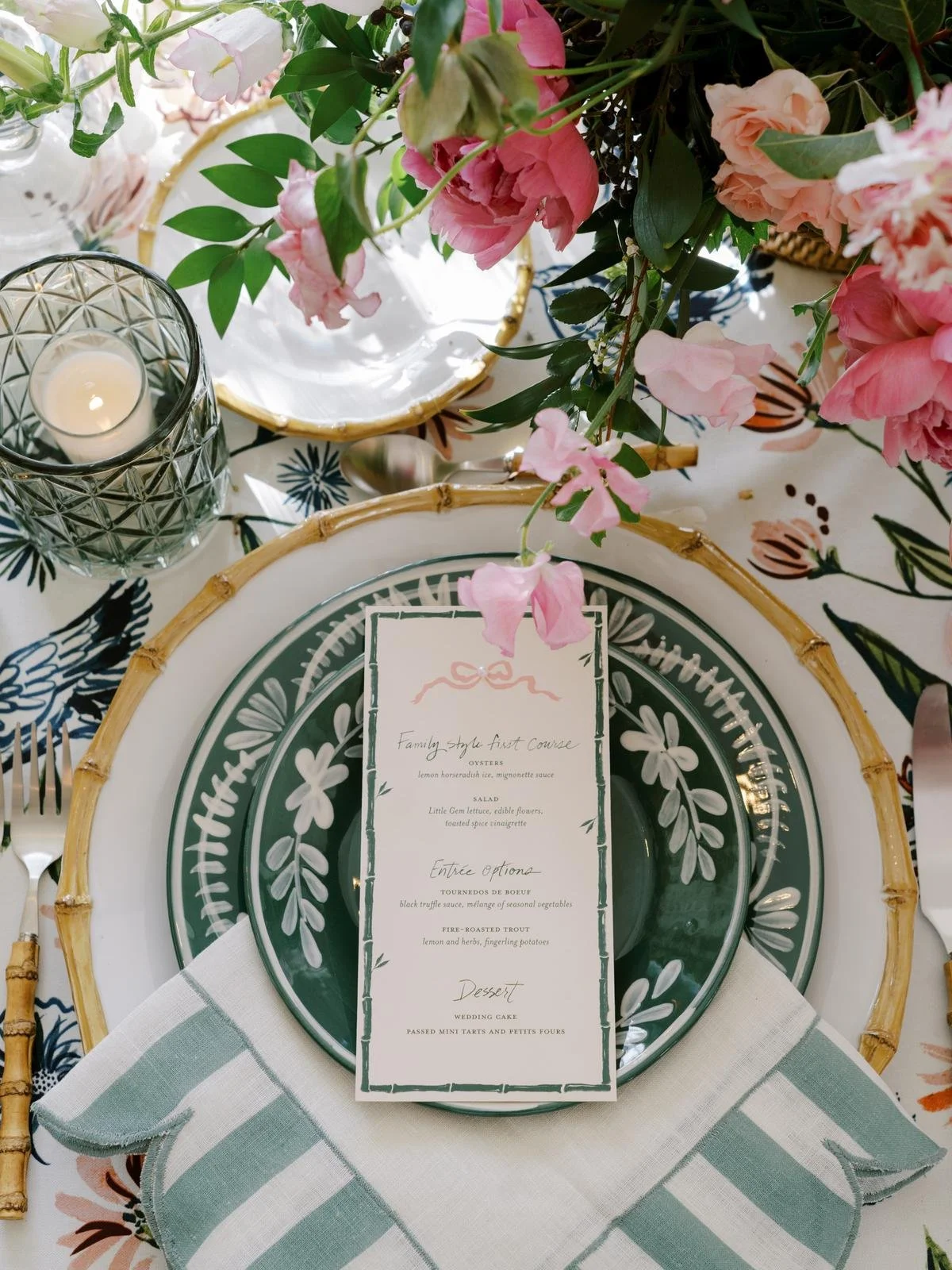
The overall color palette was a fresh blend of spring hues, while the florals were centrally focused in shades of bubblegum and blush. The use of lush, organic greenery and flowering branches paired with soft, fluffy florals created an overwhelmingly romantic vibe that felt completely natural within the setting. We leaned into the beauty of the season utilizing spring blooms of peonies, ranunculus, sweet pea, and viburnum.
The florals were natural, yet impactful and added nuanced layers of texture and color to the over all design plan and color palette. You didn’t feel like you were in an event space, you felt like you were in a secret garden or a luxury home, which was exactly the feel we wanted to achieve.
Playing with texture and light, we styled the arrangements with wicker and vintage chinoiserie compotes, and let candlelight have its moment through the use of flirty pink taper holders and votive candlelight. These floral styling elements paired with other aspects of the table design - the linens, the china, the flatware, the stationary - worked together to create something transcendent.
Planning: Kate Murtaugh
Cinematography: Willow Tree Films
Stationary: Katie Fischer Design
Signage: Something Borrowed